

Branding
Pasta Project
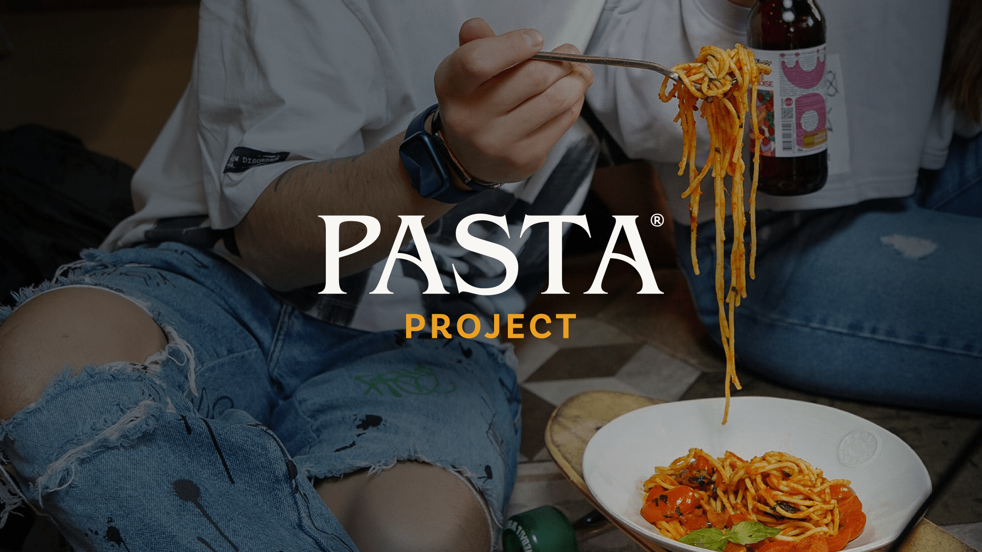
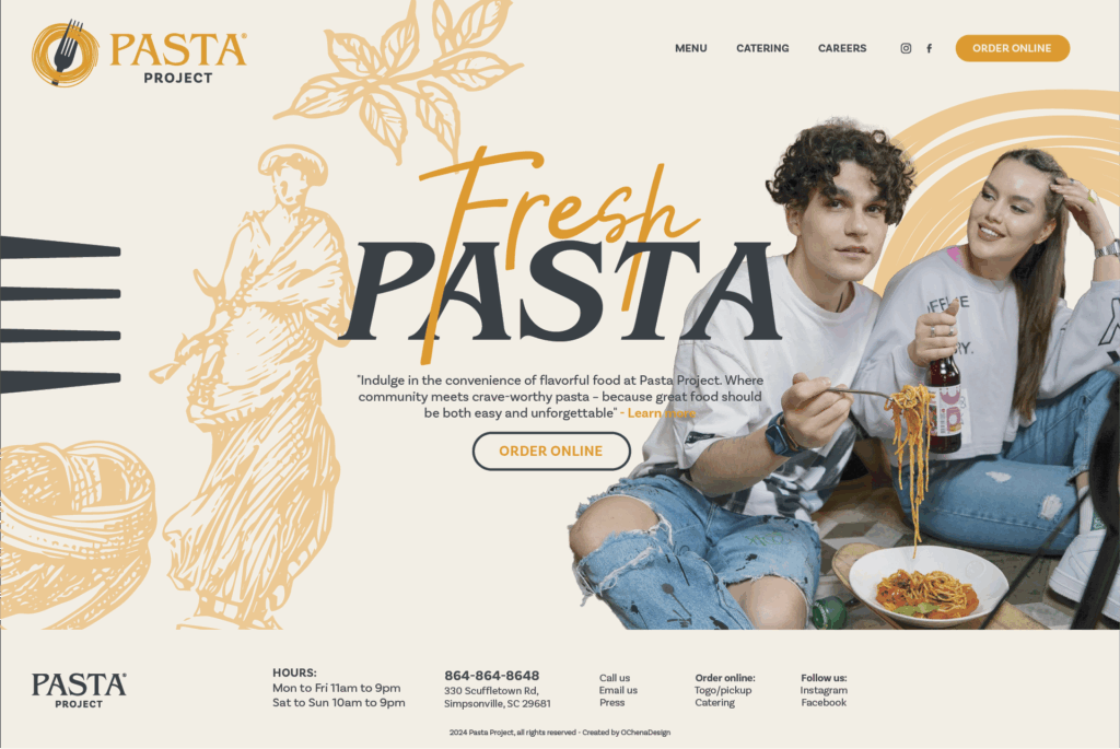
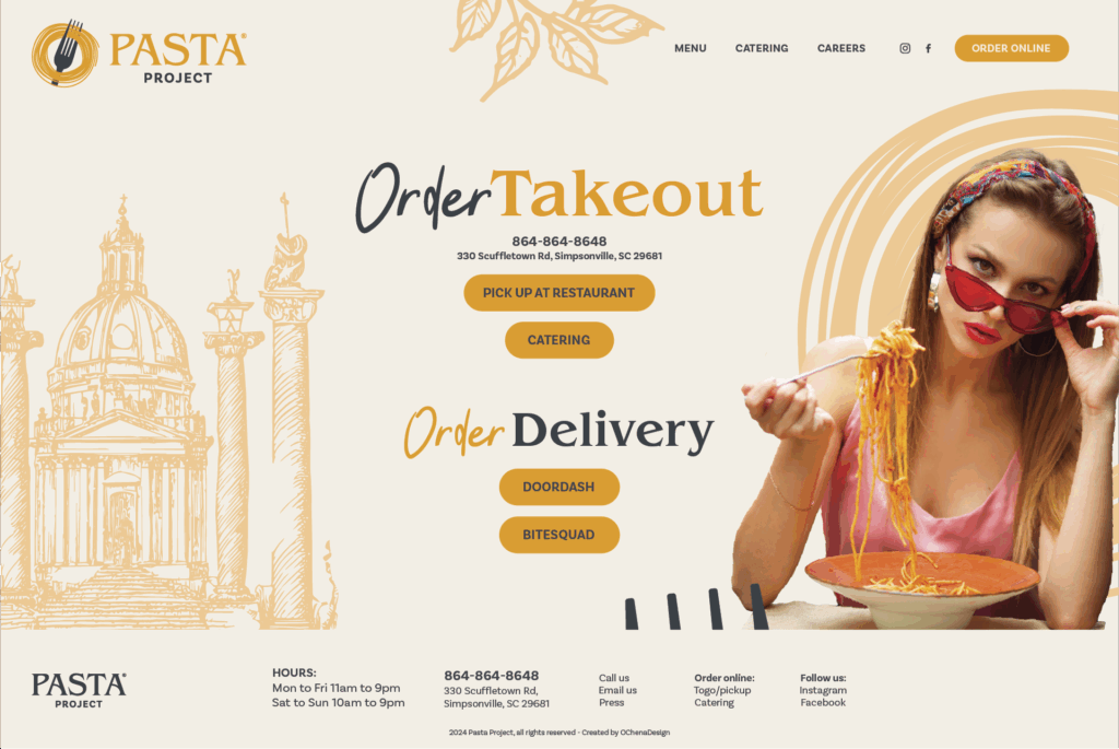
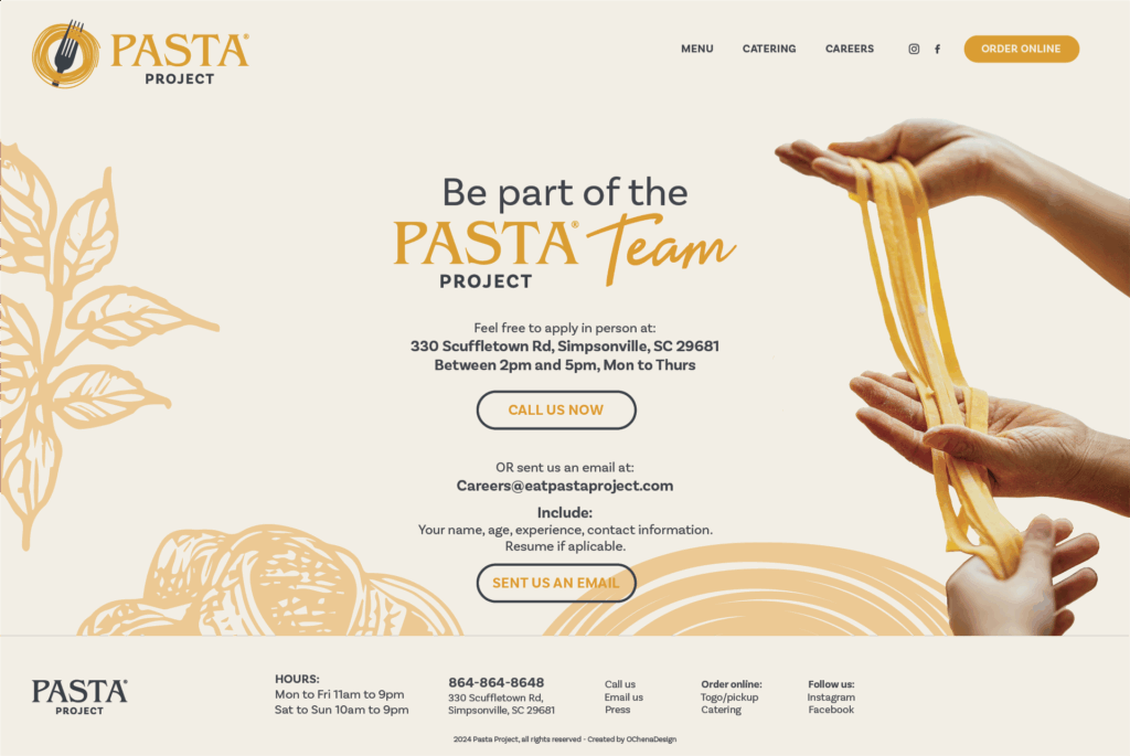
Pasta Project Branding – Full Identity Package for Restaurant Launch
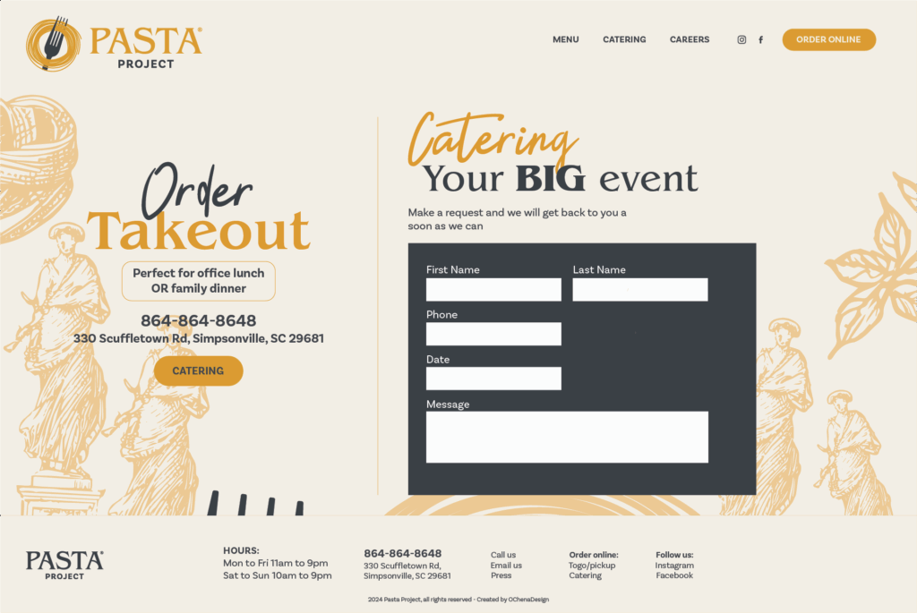
At OChena Design, we partnered with a local entrepreneur in Greenville, SC to create the Pasta Project branding from the ground up. This pasta restaurant was preparing to launch with big goals and a bold concept. Therefore, they needed branding that could support long-term growth and capture attention from the start.

Creative Direction & Branding Process
Our creative direction focused on blending rustic Italian inspiration with a modern, high-end food experience. Before sketching ideas, we met with the client to understand their vision, audience, and business goals.
Key steps included:
-
Initial mood boards and visual research
-
Custom logo design with handcrafted typography
-
A curated color palette that feels both comforting and premium
-
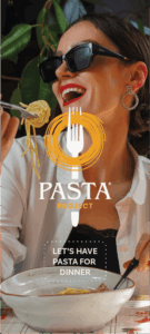
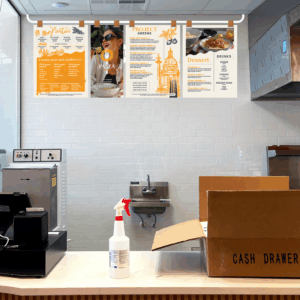
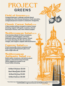
Menu design, packaging elements, and signage templates
In addition, we built a branding toolkit the client could use across marketing, social media, and in-store touchpoints. As a result, every brand element feels consistent and intentional.


Final Outcome: A Bold Brand with Lasting Flavor
The final result is a cohesive, memorable identity that represents the pasta concept’s passion for food and hospitality. The new branding has helped establish the Pasta Project as a strong visual player among Greenville’s growing restaurant scene.


Looking for Pasta Restaurant Branding in Greenville, SC?
If you’re building a new food brand or rethinking your restaurant’s identity, we’re here to help. Contact me at OscarChena3987@gmail.com
Or send me a text message to 864.325.3987